
Devices shift in size, shape, and resolution. Users hop from phones to laptops without thinking. Designers face that reality daily. So, adaptive design steps in with precision. It tailors layouts for each device category.
Responsive design steals most of the spotlight, but adaptive design waits in the wings with quiet confidence. It swaps fluid grids for fixed breakpoints and prepares several layouts instead of one elastic system. Each layout fits a device range with accuracy.
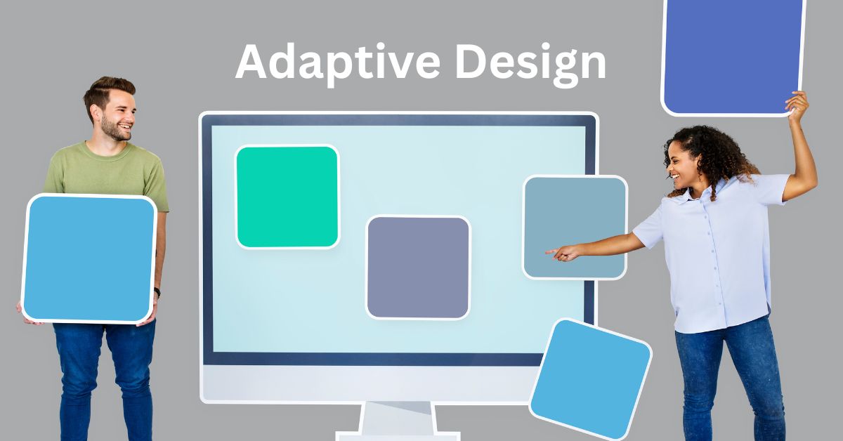
Let’s dig deep and see how it works for your web design in Geelong.
The Core Idea
Adaptive design relies on multiple templates. Each template lives at a certain width threshold. Common breakpoints include mobile, small tablet, large tablet, laptop, and desktop. The server or client detects the device type. Then the matching layout loads without hesitation.
The page does not morph mid-scroll and swaps models at the start. Each version stands complete on its own. The content may shift positions and imagery may change ratios. Each alteration matches the habits of that device’s users.
This method grants sharp control. Designers decide how content appears on each target. Nothing happens by accident. The layout never warps in unexpected ways.
Why It Works
A desktop shopper expects exploration—More visuals, deeper navigation paths, richer descriptions. The adaptive layout honors that expectation. It treats each screen as a unique environment.
Structure Over Flex
Responsive design uses fluid grids and media queries. It reshapes itself like liquid. That works for many scenarios. But adaptive design acts like a wardrobe. It picks the right outfit instead of stretching one garment for all bodies. This approach reduces design surprises.
- Elements do not collapse in odd ways.
- Typography does not shrink to unreadable sizes.
- Images do not lose context through distortion.
Design teams can fine-tune breakpoints. They can strip features for small screens or add enhancements for large ones. The experience does not rely on one layout’s flexibility but on dedicated versions.
The Design Process
Adaptive design begins with research. Designers study device usage data, detect traffic sources, learn where users click, and identify patterns by device type. Then they build key breakpoints. Each layout receives its own wireframe.
- The mobile version strips fluff.
- The tablet version balances density with clarity.
- The desktop version delivers full navigation and imagery.
Then, testing happens in stages. Each device group gets separate attention. Designers check text flow, tap targets, and spacing. Nothing slips through unchecked.
After testing, the implementation begins. Developers code separate templates. They set conditions for each version. The browser or server reads the conditions and serves the right file.
Control and Consistency
Adaptive design protects branding. Each layout keeps the visual identity intact. Fonts, colour palettes, and imagery follow the same voice. The only shifts come from layout needs and screen limitations.
This builds trust, and the user switches from phone to desktop and recognises the brand immediately. Nothing feels off. The tone remains stable.
Navigation That Matches the Screen
Navigation evolves between breakpoints. A phone cannot host a wide menu bar, so the adaptive mobile version uses a hamburger icon. It tucks sections behind a slide-out panel, and the user taps without strain.
A tablet can host a hybrid menu. Icons and text can sit side by side. The panel may float or anchor, while the space accommodates modest expansion.
A desktop can stretch into full navigation glory. Dropdowns can reveal long lists, hover effects can guide the cursor, and secondary menus can live across the header. Each format respects ergonomic reality.
Visual Assets with Purpose
Images resize across devices. The adaptive approach swaps versions. The phone layout may use a cropped or compressed file, but the desktop layout may use high-resolution photography. This saves bandwidth and sharpens clarity.
Illustrations can change their framing. A mobile version may use vertical cropping, while a desktop version may reveal the full scene. Users see what their device can showcase properly.
Content Prioritisation
Adaptive design trims content on smaller screens. Only crucial sections remain above the fold. Secondary information may hide behind accordions. Calls to action move higher in the hierarchy.
On larger screens, the content can expand into grids or multi-column layouts. Secondary sections can reappear and visual storytelling can deepen. The user sees content that suits their browsing style.
Accessibility and Comfort
Accessibility thrives under adaptive logic. Tap targets increase in size where fingers dominate, fonts scale with readability in mind, and high-contrast options adapt to each layout.
Keyboard navigation remains intact on the desktop. Hover states respond smoothly to cursors. Screen readers detect logical structure. The design supports clarity for all ability levels.
Users stay longer when the interface feels this natural. Adaptive layouts achieve that feeling with device-specific tweaks.
Challenges to Consider
- Adaptive design requires more work upfront. Each layout needs separate planning, and each version needs coding. This multiplies effort and increases timelines.
- Maintenance demands discipline. Updates must roll through each template, designers must track variations, and developers must test across breakpoints regularly.
- Costs rise with complexity. Not every project can carry that weight. Smaller sites may choose simpler responsive tactics.
Still, the investment often pays off with stronger engagement and higher conversion rates. The control factor justifies the labour.
When to Choose Adaptive Web Design in Geelong
Adaptive design suits brands with diverse audiences. Sites with heavy mobile traffic can benefit immediately. E-commerce platforms feel the impact within weeks. Media sites with long-form content gain structure across tablets. Corporate portals can tailor experiences for clients on multiple devices.
Legacy systems can also adapt the adaptive method gracefully. But some older platforms cannot handle fluid responsive logic.
Final Thoughts
Adaptive design crafts distinct experiences for distinct screens. It rejects one-size-fits-all philosophy and shapes the journey through tailored templates. It values performance, clarity, and relevance.
To execute it effectively for your web design in Geelong, contact the professionals at Make My Website. You’ll be glad to have their insights with you.